Problem & Solution
Calendars today are all the same. That alone isn’t good or bad, but the way data is displayed is not the best possible: in a table. In this project, Marius and I tried to create a usable alternative to Google Calendar, the basis for our project.
Don’t care about research?
Jump to the product ↓
We’ve seen a possibility in the endless amounts of data companies like Google store, but don’t use in their user-facing interfaces. Take GCal for example: all different interfaces, like Week or List View, are tables that only display basic information: time, date, name and the color of the parent calendar. That’s it.
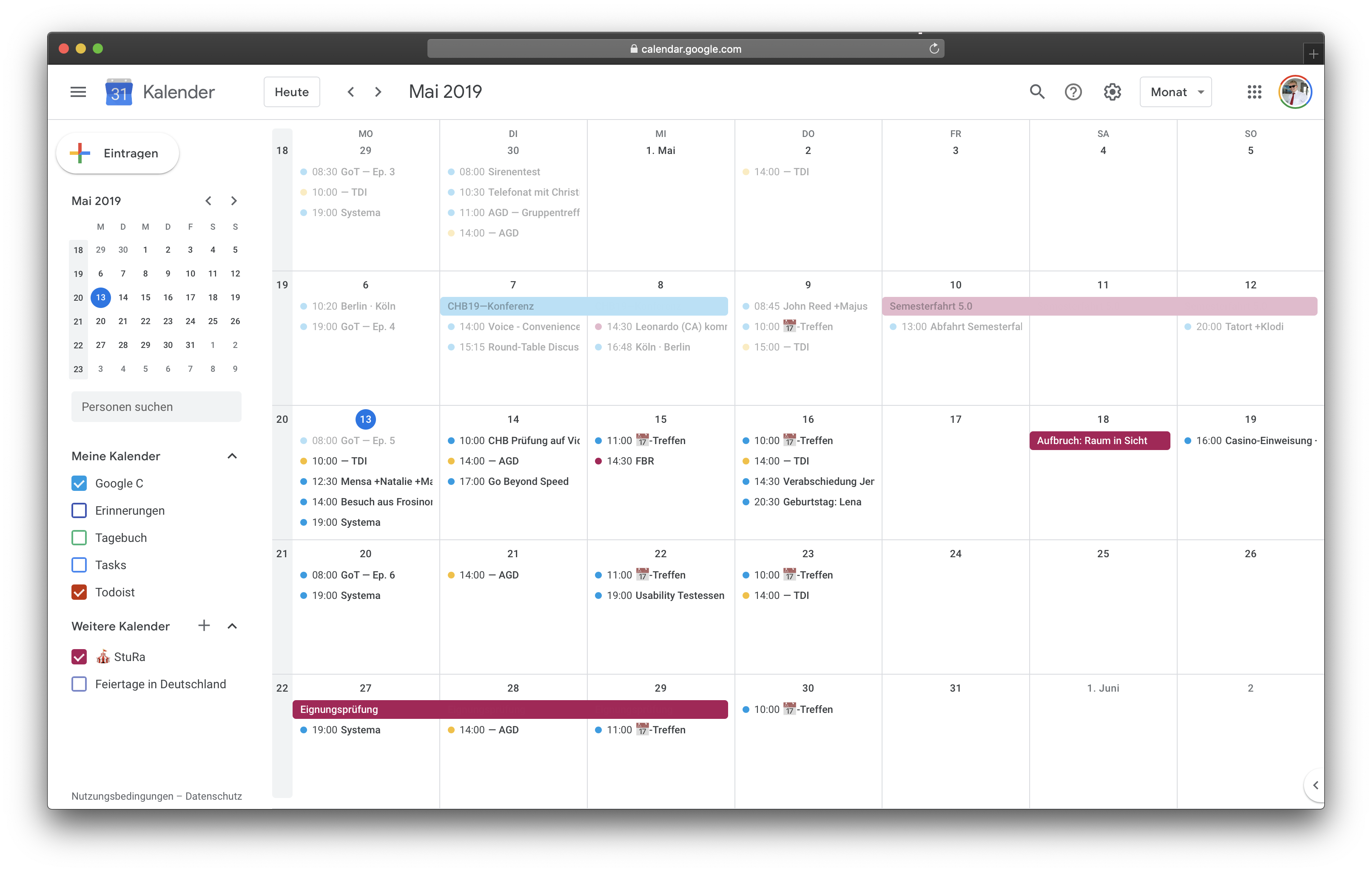
In these interfaces links between data sets are available, but not displayed. Take, for example, two appointments directly after another. Both of them have starting times and a location mapped to it, but the connection between the two—like the time needed to go from A to B—is nowhere displayed. But why?
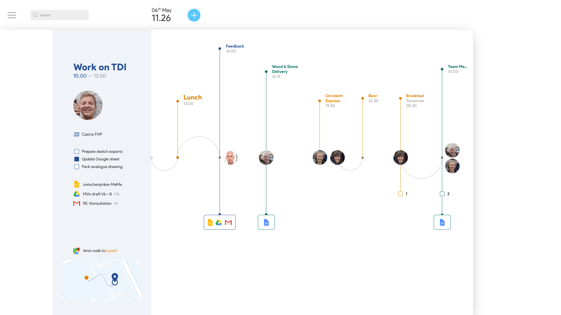
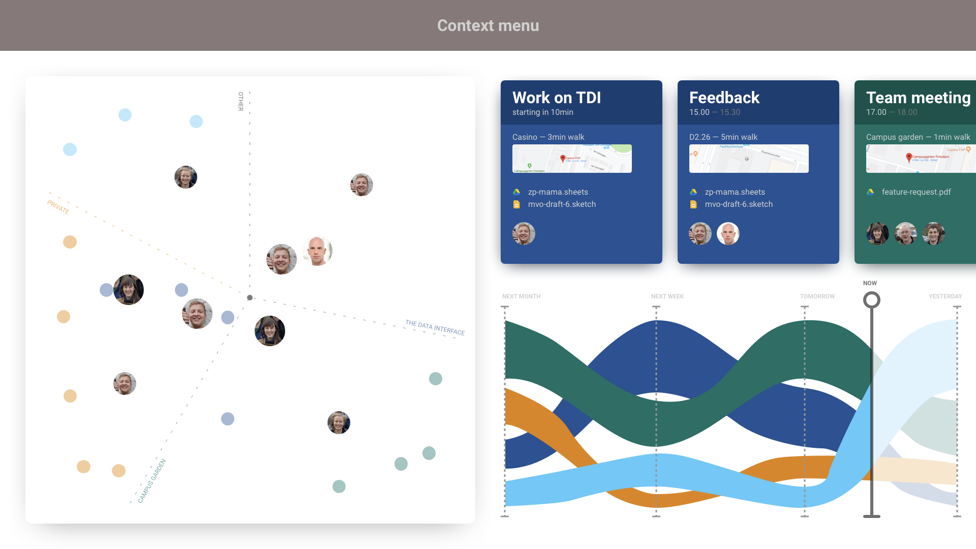
Our solution for displaying better data in calendar interfaces is Google Streams. It’s a data visualization that itself has become the interface, and migrates a more human-friendly understanding of time into its interface.
Understanding Google Calendar
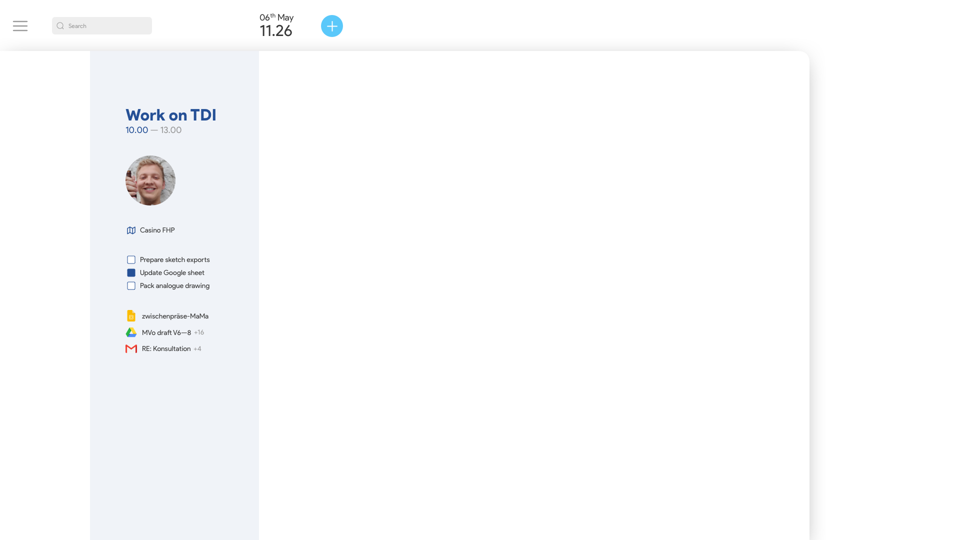
When breaking down GCal into into its individual parts, we put data into one of seven entities: Titles, Places, People, Time slots, ToDos, Files, and Descriptions.

The links between these entities are particularly interesting. An example of this is the route, which automatically results from two consecutive dates. Or the linked persons who work on the same file in the past or in the future. All calendar entries are a combination of atleast one of these entities.

These entities were the foundation for our design process where we avoided tables and linked the existing data together.
On the way to Streams
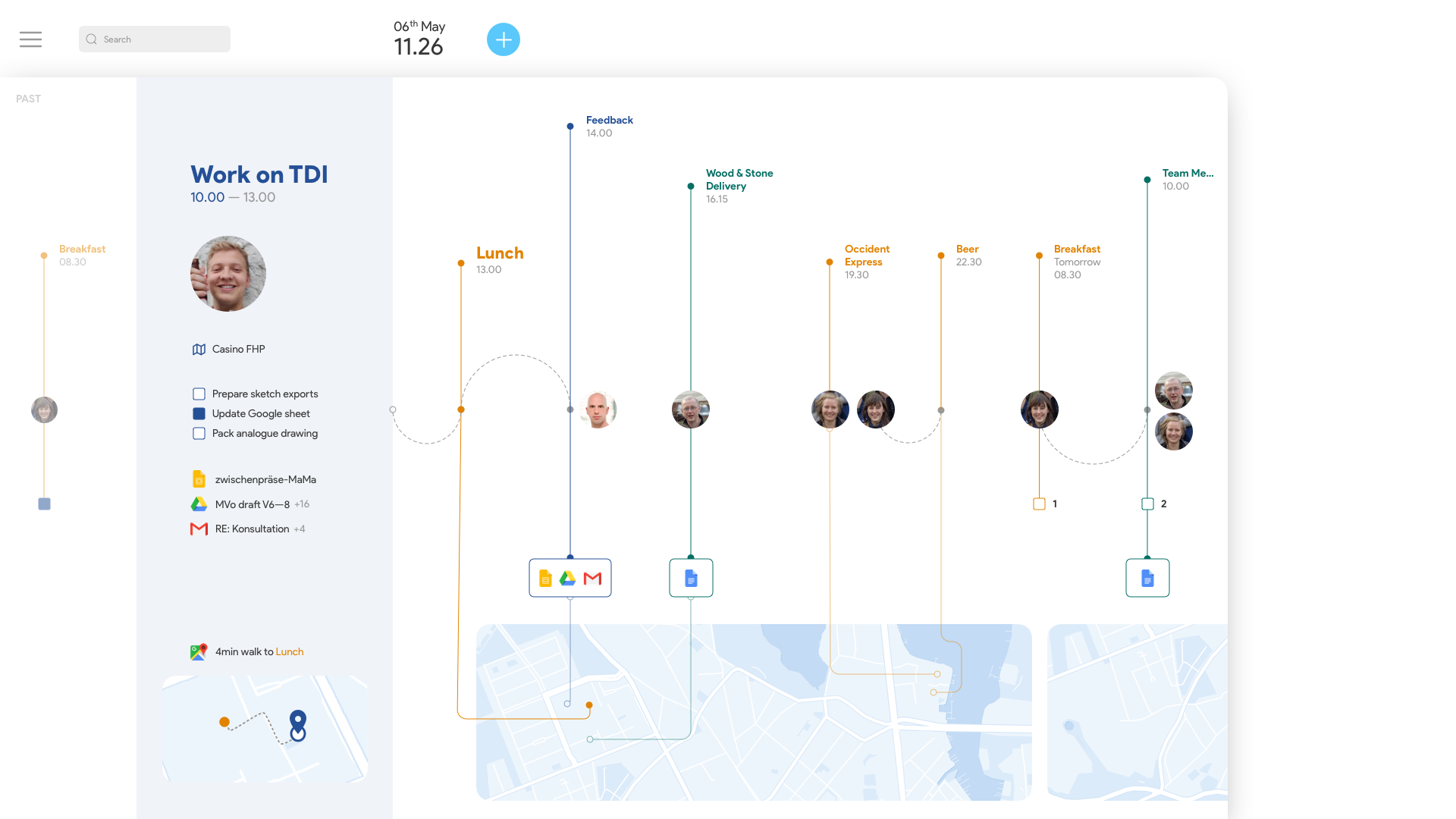
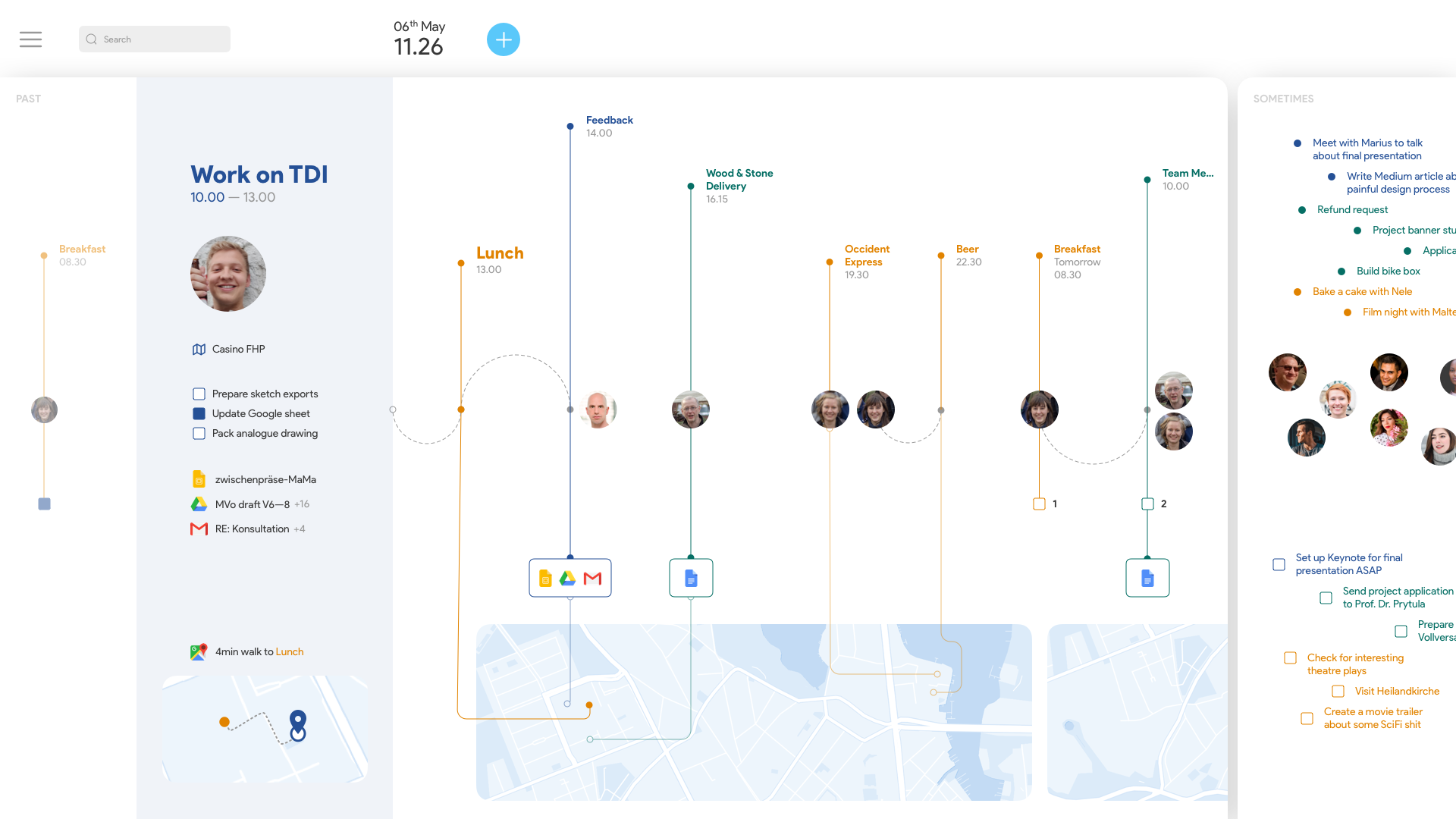
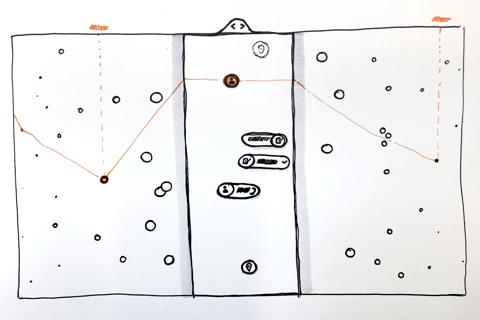
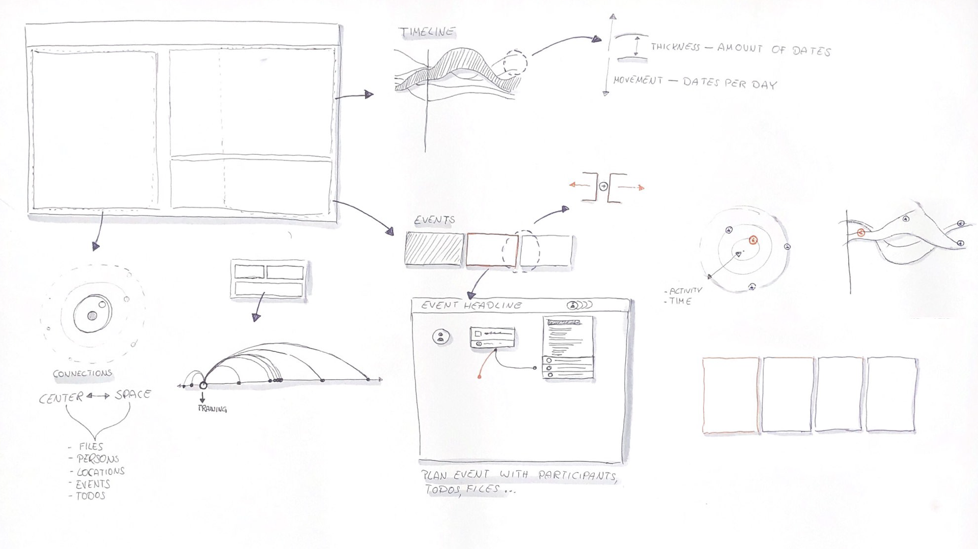
Simply reinventing time. The representation of time and how time should run has led to the most intense discussions. We agreed that there should be three consecutive areas. On the left the past, in the middle an active area for the present and on the right a planning area for everything indefinable in the future. Freely floating entities ensure that the interface is loosened up and that the elements can be connected with each other over all times if required.
“Oh, that’s another table …” Alternatively we developed a stricter wireframe using a grid that chronologically displays all events in the horizontal. How long an event lasts doesn’t matter in this version. In the vertical, each event is divided into the seven entities, which allows a simple comparison between the individual units. With the design, we—again—returned to a table, which is why we distanced ourselves from this representation and initially followed the freer approach.

Display data ≠ Read data. During the digital implementation, however, new rules had to be introduced to allow a certain readability for the freely floating data. So-called streams divide all data into categories - in this case “study”, “campus garden”, “private”. Entities that belong together are also joined together to form units. At this point, however, the result showed that this visualization generated too much redundant information, which meant that links were not clearly recognizable.

Wordcloud? Eventcloud! In order to solve this problem, we neglected the typographic elements on both sides in order to direct our attention to the middle and thus to the present. On the positive side, it can be emphasized that the generated data cloud makes the "now" area more visible and also the important links can be identified more elegantly. However, the representation has lost readability due to the separation of the entities from each other. It is not directly visible which event is currently important with which parameters.
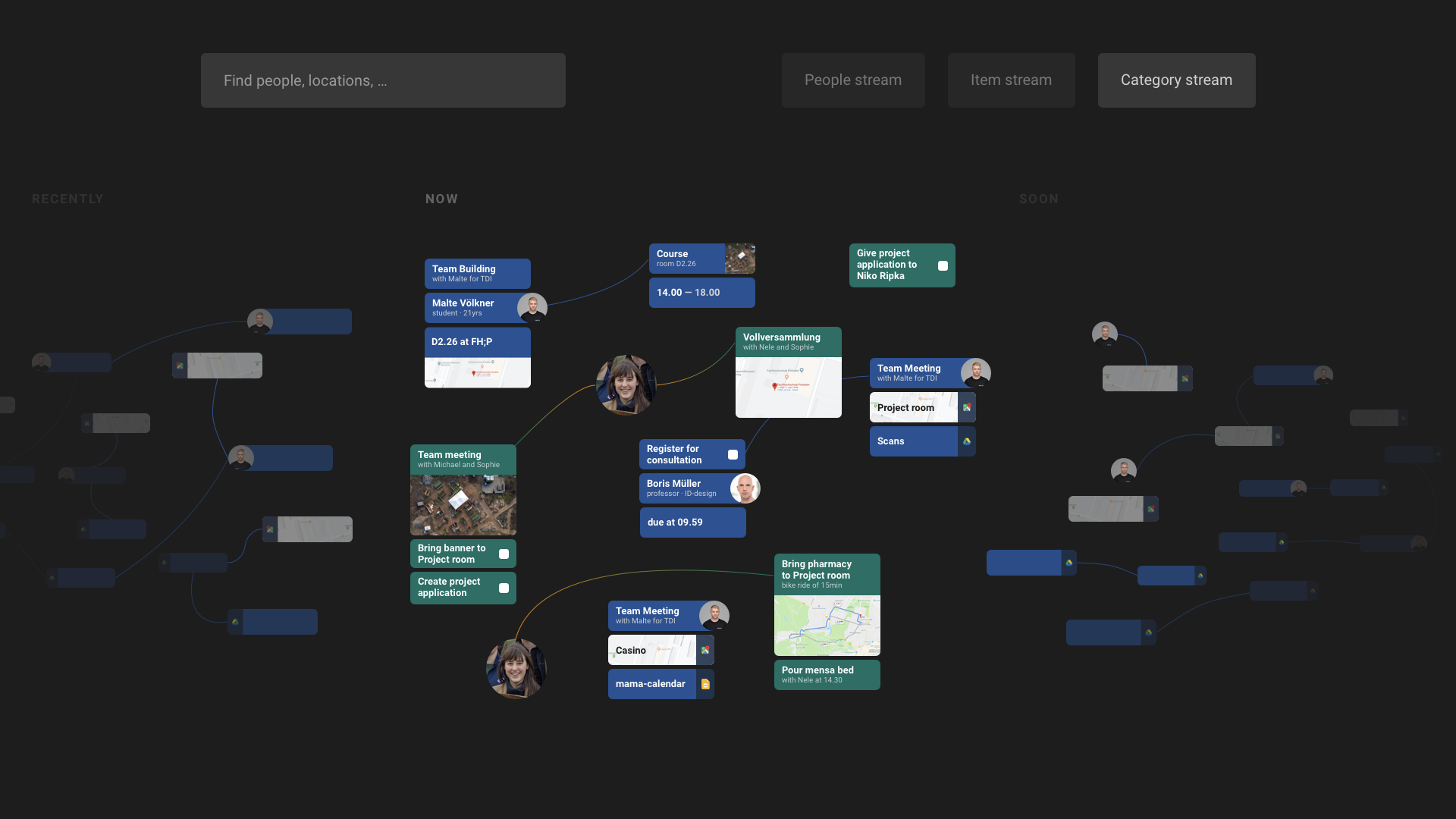
Google Streams becomes a Dashboard. After these—and countless other iterations—we had the feeling to be running in circles. We introduced certain representations, discarded them afterwards and then used them again, because the new iterations didn’t work and only created new problems. To escape this dead end, we took our previous designs and dissolved them into their components to get an overview of our elements.
We then compared the results with our target definition. We looked at the most important network forms in separate windows and compared them in a common interface. The three areas that emerged made it clear to us that we demanded too much from a single interface. Too much free space leads to poor readability and too strict design rules prevent the display of links.
Back to the roots. Through this knowledge gain we focused on developing a new form of design. We came across one of the first wireframes, which seemed too grid-heavy and combined it with the "streams"-iterations. It was also important to us to reduce the entities to be displayed to a minimum. With the introduction of a map— which represents the entire day—each day even receives an easily identifiable overview.
Of course the focus on the representation of networks is still missing until now, but with the last iteration we have made an important step.

The whole project had a certain conflict of goals: the goal of the course was an operationalized data visualization. Our additional claim was to design this visualization as an everyday tool. The idea at the beginning was to replace the Google Calendar and to improve the integration of other Google services.
Through the focus on user-centered design, however, the focus has repeatedly shifted away from the actually interesting characteristics of our visualization, mainly the uncovered links between different entities. In addition, we were quickly intimidated by the edge cases that destroyed our systematic ideas. Although we were always pursuing new approaches, they often got stuck in the digital implementation after the first iteration. Interaction problems with the interface designs or the data made progress more difficult, so we first went for a solution to the interface problem than to try to design suitable representation possibilities for data. Here we have room for improvement.
The linking of the location-data worked better. In a usability and data visualization context, we were able to find a suitable solution that met our initial target description well. However, we could have extended this detailed elaboration of the connections to other entities as well, for example to the processing of documents and the persons associated with them.
Apart from that, we noticed a certain “David versus Goliath” mentality in the visual design of the interface — there is a good reason that most calendar tools offer very similar views; they are simply the most suitable for an efficient use of a calendar. This, coupled with the integration of new services, is a more complex task than we thought.
Learnings
Many iterations cause frustration, but should not intimidate. The frequent changes of direction during the course of the course were frustrating — if we were able to solve a visual problem with elaborate methods and detailed sketching, many new problems occurred after implementing it. It would have helped to start from zero more often and not just go back two steps. So we stayed true to the first visual ideas, but we turned a lot of loops unnecessarily.
To perceive the indeterminacy in the design process as an opportunity. To get the methods learned in our previous studies out of our heads is not that easy - we have found it very difficult to get away from user-centered design and focus on free data visualization. Often we tried to solve interface problems with systematic—and thus restrictive—methods. The right approach would have been to approach the topic of data visualization with a new and freer direction. In short: work more agile in the future.
Especially with operationalized data visualizations, usability is not limited. A frequent point of discussion was the unclear boundary we wanted to draw between data visualization and calendar tool. Difficult was, that there should be a usability in the everyday handling of the calendar and the data should still be visible in the background in the visualization. A clear decision, early in the process, would have made a simpler design possible.